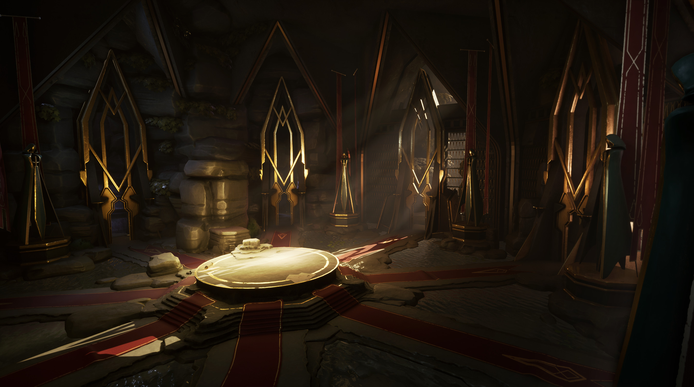
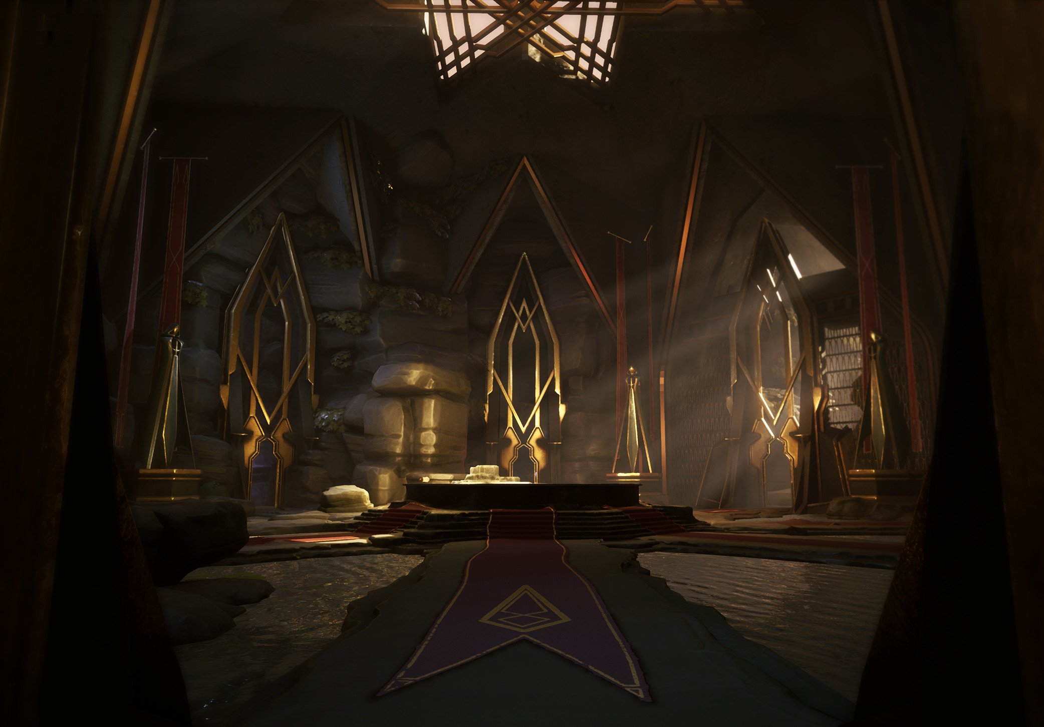
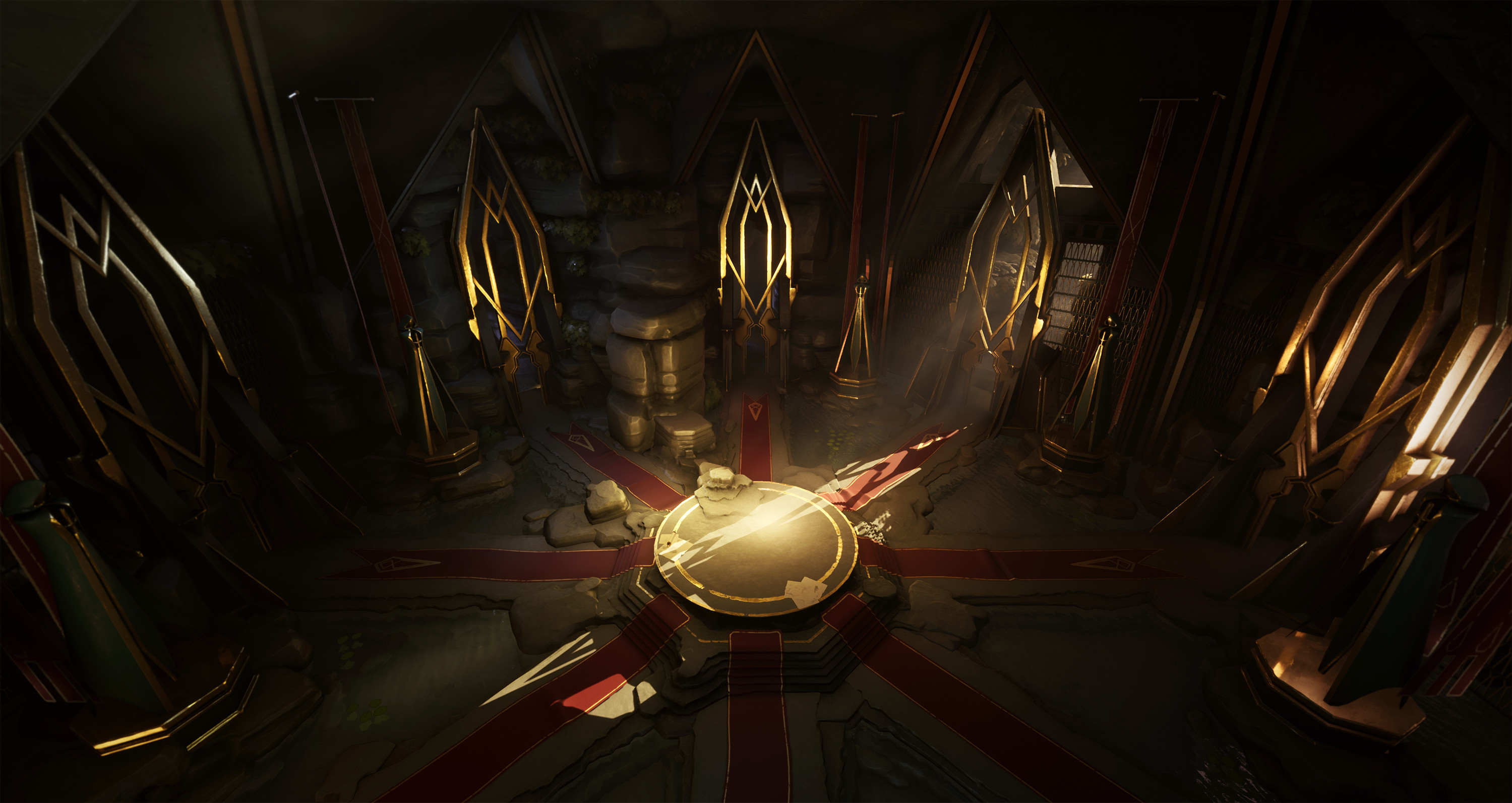
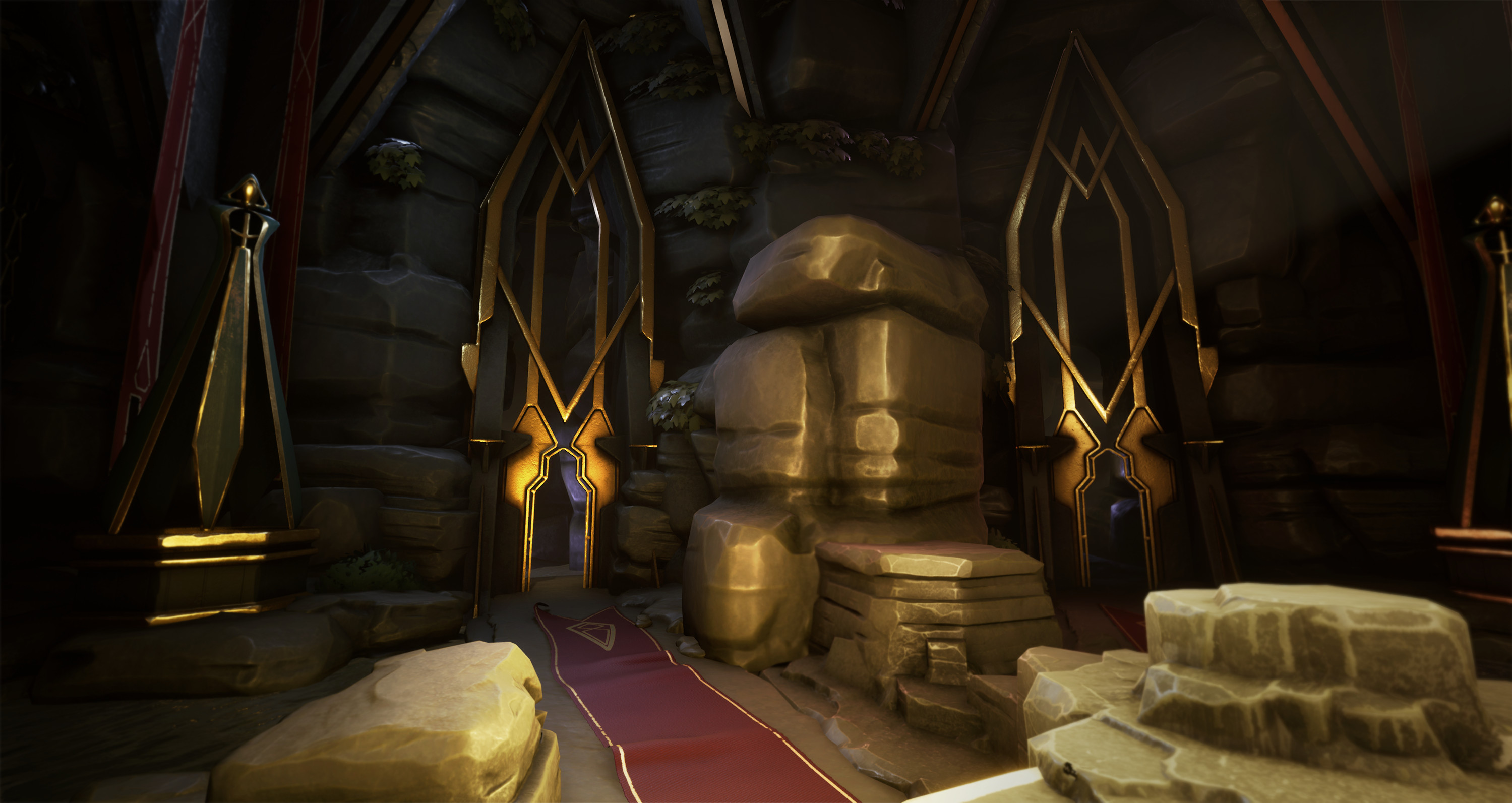
The round table stylized environment
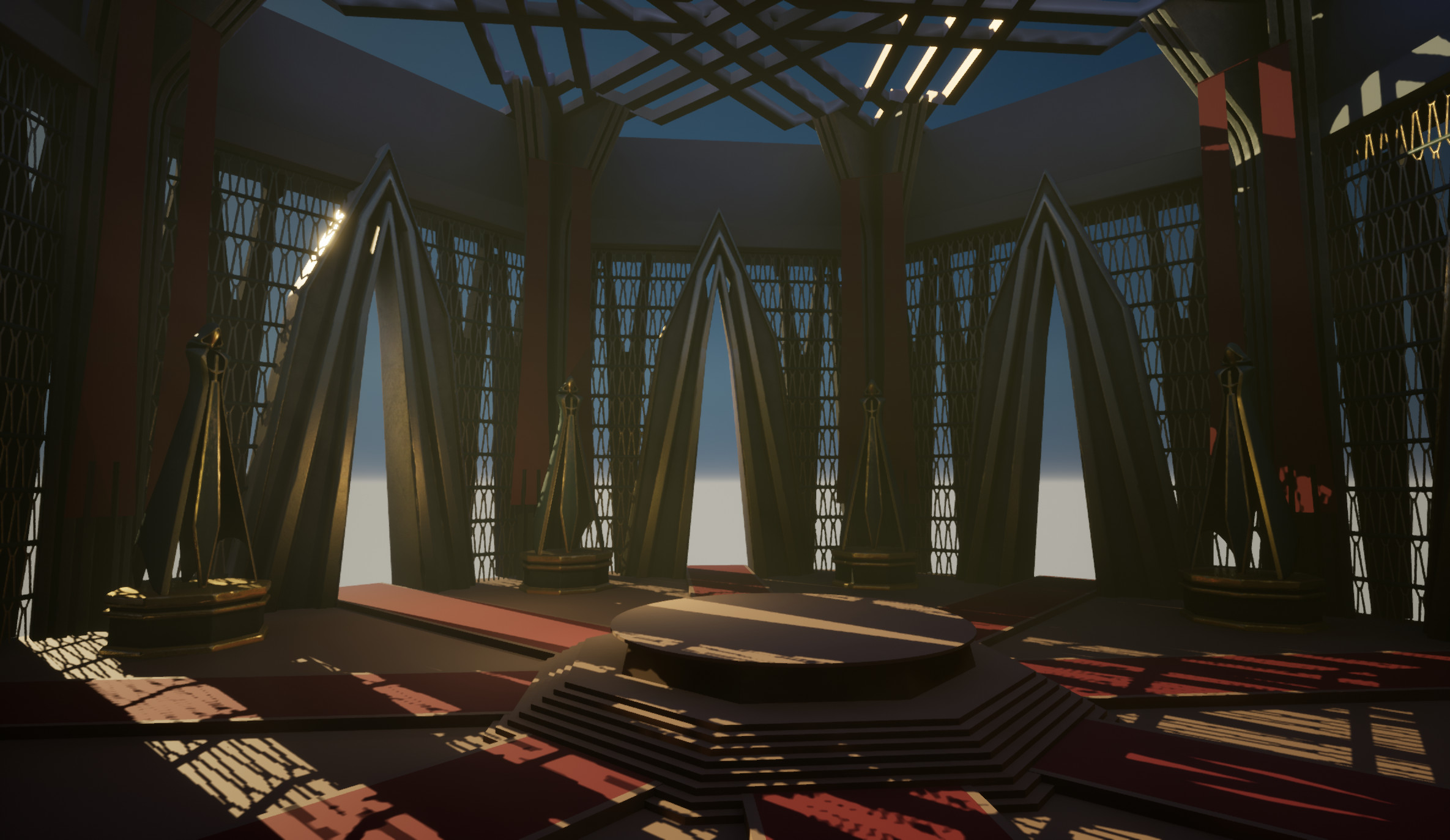
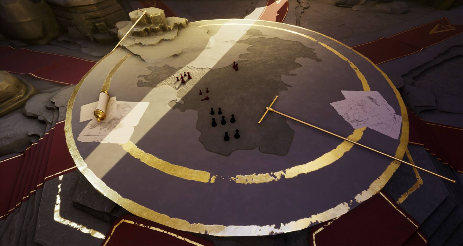
This started out as part of the King Arthur Artstation challenge. Around the end of the challenge it wasn't where I wanted it to be yet so I polished it after the final date as I did want to finish it. There are still quite a few things that I would like to change or add but I'd rather move on to something else for now, but I might come back to this one later.
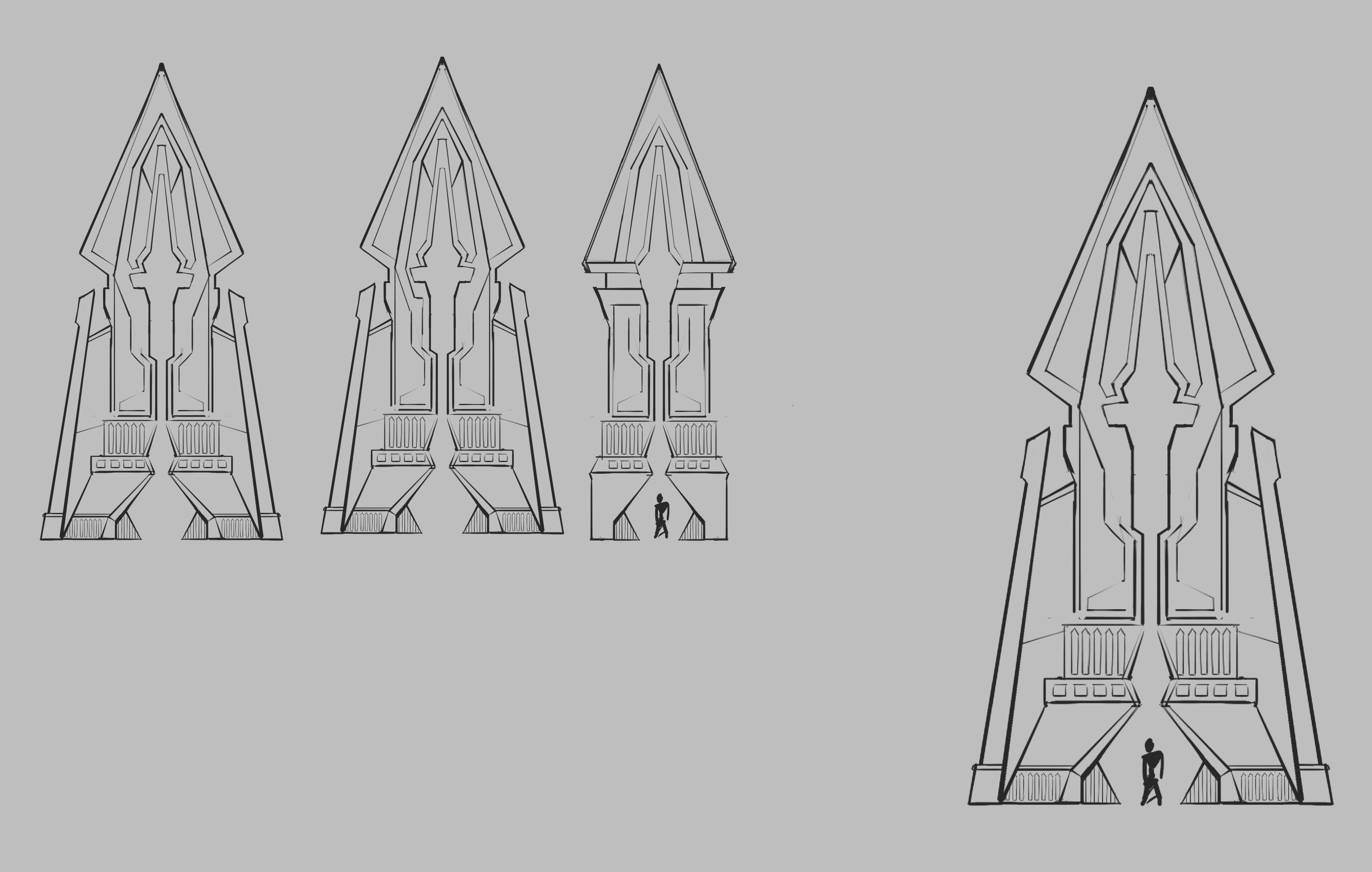
This was based on a concept by Fernanders Sam. I started out by staying true to the concept a lot more in the beginning, but later on I strayed from it a bit more. I wanted to break the repetition a bit more and build the hall half into a mountainside, and try to incorporate the natural elements with the architecture a bit more. Apart from that I also changed the doors, the original design had very simple and abstract shapes which looked cool but it was hard to convey scale with them in 3D. I tried to stay true to the original design language.
https://www.artstation.com/artwork/dORkPe
Godrays made with a material that fades in and out based on distance to make it feel volumetric. Basically a 'fog card' material with some panners, one for the dust effect and another one on a 2nd UV channel that is 'squashed' down for light shaft effect.

