
You can also check out this blog over at 80 Level
Part one - water wrinkle effect basics
Part two - water wrinkle effect opacity
Part three - waterfall basics
Part four - waterfall color, opacity and vertex displacement
NOTE: This blog post contains loads of GIFs, I recommend you don't view this if you are on a mobile network!
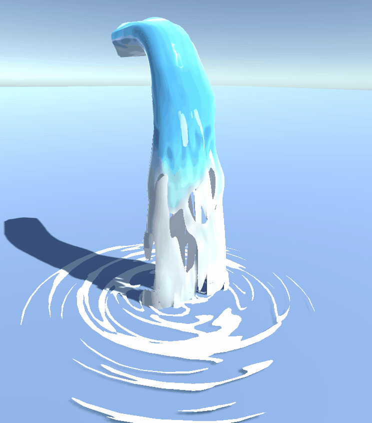
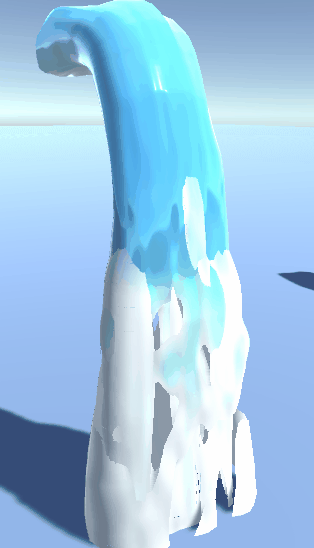
In the previous part we set up our mesh, the UV's, and some basic stuff we will need in the shader to make our waterfall work. First let's analyze a few things we see in the waterfall GIF above. You see 'water' scrolling down the 3D mesh, breaking up when it falls down. You can see we also use the transparent cutout render type - the waterfall either is fully opaque or fully transparent. The waterfall also changes color once it is nearing the ground. You might also notice the water looks a lot less smooth on the white (foam) areas then it does on the blue areas. Next to this, you can also see some vertex displacement we talked about earlier. This gives the waterfall a far less static and much more lively feel to it. We will discuss each of these things, starting with the simpelest one: the color. I recommend that you just read along for now, and if you want to recreate it wait untill you have read everything.
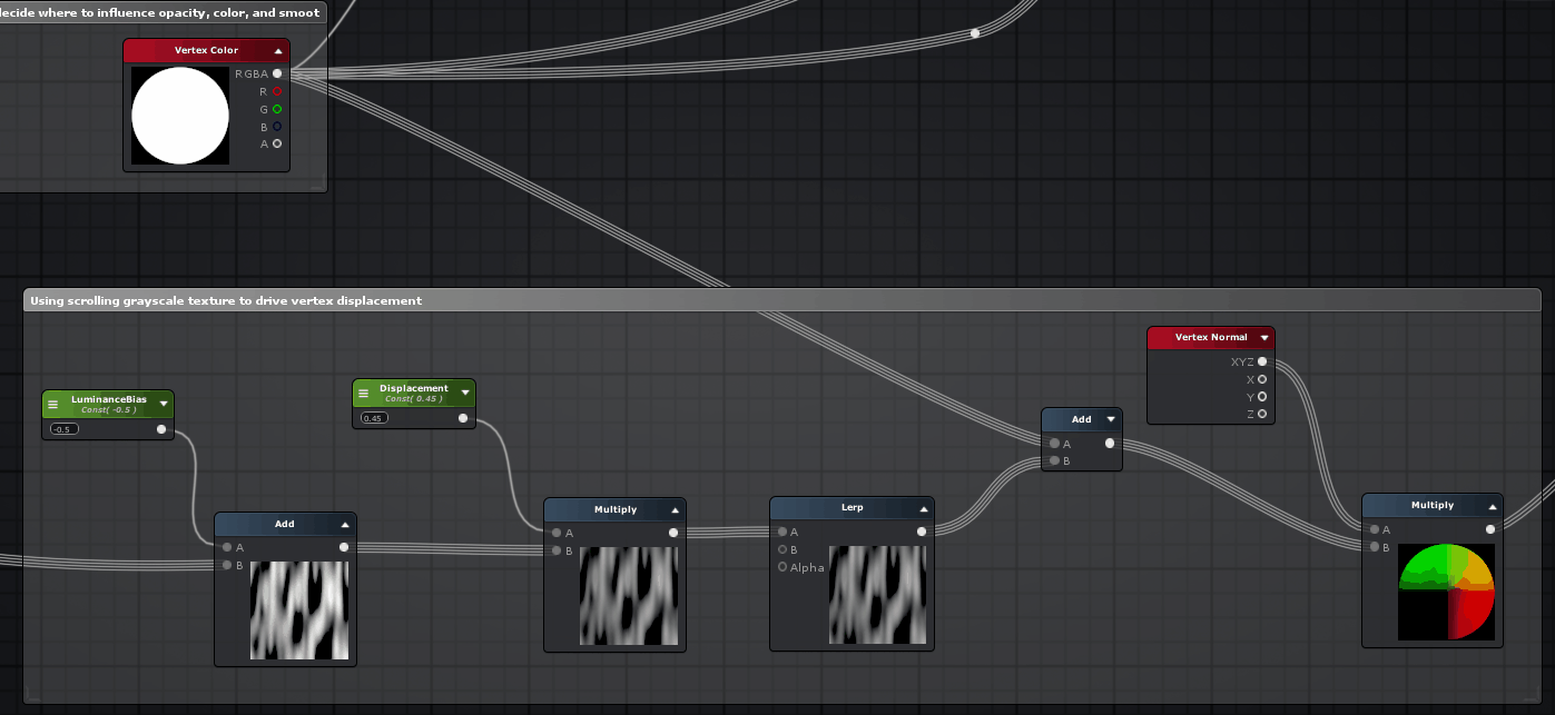
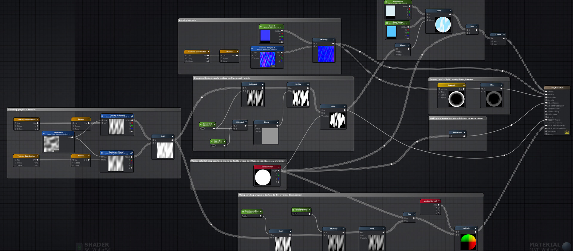
As you can see, I'm just lerping (linear interpolation) 2 colors. Roughly said, I'm using the scrolling grayscale texture we made in part 3 here as the alpha for the lerp. This means that the scrolling grayscale texture we supply as input basically acts as a mask to decide whether to show the blue color, or the white 'foam' color. The add here is hooked up to a vertex color node.
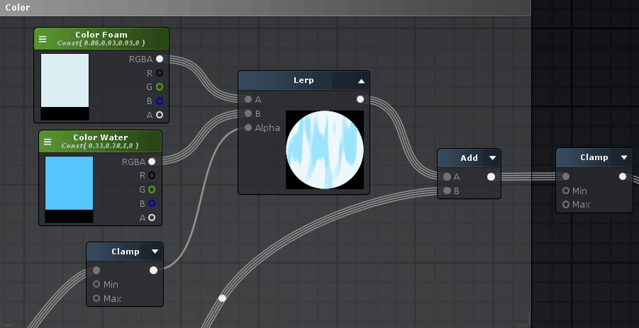
Below you can see the vertex colors I'm using. Similar to how we utilized vertex colors in part 2, it act's as a gradient. This time however we are using it to drive some other things aswell. For the color we use it to make sure the water turns more and more white towards the bottom of the waterfall, by adding it on top of the color output of the lerp. The reason we use a clamp at the end, is to make sure the maximum values do not exceed 1 (the clamp has a min of 0, and max of 1). Because we add the vertex colors on top of the color we already have (the whitest point of the vertex color = 1), you see how this could easily exceed 1. When we plug values more then 1 in our color input of the main node we would get unwanted results (too bright). The way we are using the white and blue colors also makes sure that once the water 'breaks' it is in a white (foam) area of the mesh and will always have a white border around the transparant areas. Apart from this, the lighter the vertex color, the more the vertices are pushed outward. This way the bottom of the waterfall, which is lighter in vertex color move a lot more wildly. As you can see the bend of the waterfall is also a bit lighter so it moves more.

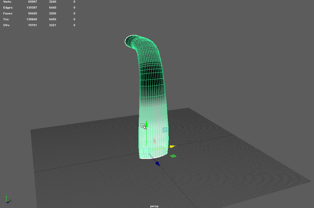
Apart from this, I also have 2 extra meshes inside the main waterfall. This is so that the waterfall feels like it has more volume. The other two meshes are modified versions of the main mesh, with the same UV's but only moved around a little in UV space / flipped so that the material looks different on all 3 meshes. If you need a material to look random, stuff like this doesn't cost anything extra in performance and will help a lot.
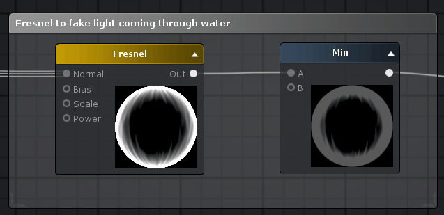
Additionally, I also used a fresnel in the emission to fake the light coming through the water. A fresnel makes a pixel more white the more the surface of a 3D object 'looks away from you' (based on the vertex normals) and more black the more it looks 'at you'. Because the waterfall is 'thinner' when you look at it from an angle, I used a fresnel to fake more light coming through the waterfall in those areas. I just used the normal from part 3 aswell (it uses the supplied normal and the vertex normals of the mesh to calculate the 'direction' the surface of the 3D model is facing). I used a min node to tone the fresnel down a lot. Obviously we don't want the waterfall to look like it actually emits light itself so the effect has to be a bit subtle. Fresnels are often used with water shaders to change the color based on the angle you are looking at it. Pluggin in 0 (black) into the emission wouldn't do anything, and plugging in 1 (white) would sort off make it an 'un-lit' shader, making it ignore the lighting situation and look fully lit from all direction even if it would stand in a shadow. If you want you could multiply the result of the min-node with a color so you can control the color of the fresnel and plug, for example, a yellow fresnel into the emission.
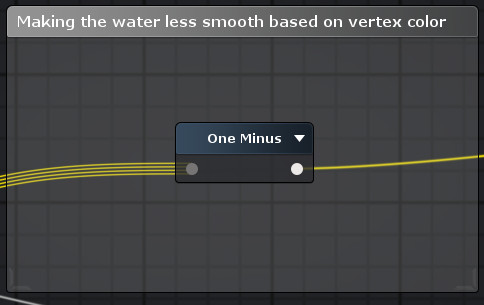
For the smoothness, I took the vertex colors and 'flipped' them using a one minus node. If you scroll up a little bit, you see the vertex colors are light at the bottom and dark at the top. By flipping this (so light at the top and dark at the bottom) we can use this to make the lower part of the waterfall less smooth (or shiny), compared to the top. For smoothness, darker values equal a less smooth surface and lighter values make the surface more and more smooth.
Vertex displacement, or vertex offset, is an important aspect we need in order to sell this effect. By moving the vertices around the waterfall feels a lot less static, and a lot more alive. To illustrate, here's the same waterfall but without any vertex displacement.

By moving the vertices based on our scrolling grayscale texture we discussed in part 3, the waterfall feels a lot more like it is actually flowing. If you route a value of 0.5 into the vertex offset output of your main node, nothing would happen. Try to see a gray value of 0.5 as the 'standard' value of a vertex. Everything below 0.5 will move it in the negative direction, and everything above 0.5 in the positive direction.
So how do we know what 'direction' the vertices will really move? What is up and down?
In our case, we want to move the vertices away from the surface of the mesh. In our case a negative direction would mean a vertex would move 'backwards' compared to where the surface is pointing at, and a positive direction would move it 'outward'. If we want the vertices to move like this, we can utilize the vertex normals. Every vertex, even though they are just a single 'point' in 3D space, all have a direction assigned to them. This direction is what we call the vertex normal, and it is used to calculate how the surface of the mesh should be shaded. In this example image I made a sphere, and set Maya to show the vertex normals (display>polygons>vertex normals). As you can see each vertex has a direction that is pointing away from the surface by default. If you wanted you can edit each vertex normal and change it's direction but for now this is what we want. We can now use this direction in the shader and use it to tell the shader in what direction to displace the vertices.

The 'vertex normal' node outputs RGB values, that are based on the normal direction of the vertices of the mesh. In shaders and with normals in general RGB values are being used to express 3D XYZ direction in 2D space. We can use the RGB output that describes the surface direction to move the vertices around in that direction, by multiplying our grayscale panner we made earlier, on top of it. I added the vertex color the vertices displace 'outward' more at the bottom of the mesh. I added a few nodes to control the displacement amount (it's ok if your values go below 0 or above 1 in this case).
To illustrate, here's a sphere with a vertex normal node applied directly to the albedo (color) output of the main node.

The RGB (XYZ) output of the vertex normal node is based on the vertex normals of the mesh, giving us this result.
Here's the full node structure, so you can see how everything connects.
I hope I taught you something! I know it's a lot on one go. The goal was to give you enough knowledge and starting points to make this or similar effects on your own. Do realize that to make stuff like this you don't have to know and understand everything. You just have to know and understand enough to give yourself a good starting point so you know what to look for when trying to go for a certain effect. It's not like I just opened Amplify and build this effect in one go - before I had this waterfall I had several others that just didn't work out. It's a lot of back and forth, tweaking of values, and googling how others did it. Even though my starting point was Simon's talk - I still had to do quite a lot of research, but in the process gained a deeper understanding of what I was doing, which is the most important thing. I hoped to pass on some of this knowledge by writing this blog.
If you found all of this interesting, here are some links that inspired me and might be of interest to you.
- A talk by Julian Love who worked on Diablo as a VFX artist. He has a great talk that is worth your time if you want to learn more about VFX in games. This talk mainly goes into skill effects but many of the things shown apply to other types of realtime VFX as well.
- This blog by Little Chicken Game Company. This specific blog posts goes into creating game art without textures - and uses a lot of cool techniques to still make the environment look good. It creates a unique look and is worth checking out.
- Simon Trümpler, who inspired me to create this waterfall, also has many other really interesting things on his website. One of my favorites is a page with so called 'game art tricks'. There are so many cool techniques to be found here regarding VFX but also things like optimization. I'm sure you'll find many things that will inspire you here.
- I really liked this youtube channel that does a lot of shader-related videos. My favorites include the videos in which he recreates specific effects from games (in Unity).
If you got any questions, suggestions or other things you want to say, feel free to send me a message or leave a comment down below! If you want to contact me you can message me on Artstation or on Instagram.
Part one - water wrinkle effect basics
Part two - water wrinkle effect opacity
Part three - waterfall basics
Part four - waterfall color, opacity and vertex displacement